Castle Print & Design

Commercial printing for businesses throughout the UK & Europe.

  • E-mail
  • Facebook
  • business-cards-icons-Bonne Maman Logo
  • business-cards-icons-Ecover_logo
  • business-cards-icons-EPC_logo
  • business-cards-icons-FF-logo
  • business-cards-icons-halle-logo
  • business-cards-icons-harley
  • business-cards-icons-Hipp
  • business-cards-icons-HMV
  • business-cards-icons-jet2
  • business-cards-icons-LIB
  • business-cards-icons-Littlewoods
  • business-cards-icons-Marks__and__Spencer
  • business-cards-icons-marley
  • business-cards-icons-Mencap
  • business-cards-icons-NHS
  • business-cards-icons-RD_LOGO
  • business-cards-icons-samsung
  • business-cards-icons-Seat
  • business-cards-icons-Tesco
  • business-cards-icons-The_Open_University
  • business-cards-icons-thyssen-krupp
  • business-cards-icons-vbulletin
  • business-cards-icons-Vodafone
  • Home
  • Select A Product
    • Booklet Printing
    • Brochures & Leaflets
    • BUSINESS CARDS >> select for more options
      • Shaped Business Cards (die cut)
      • Laminated Business Cards
      • Spot Colour Business Cards
      • Spot UV Business Cards
      • Thermo Business Cards
    • Canvas Prints by Migglet
    • Continuous Stationery
    • Digital Printing Service
    • Envelope Printing
    • Folder Printing
    • Forms Printing (NCR)
    • Label / Sticker Printing
    • Letterhead Printing
    • Wedding Stationery
  • Other site info
    • About Us
    • Artwork & Design
    • Copyright Information
    • Envelope Sizes UK
    • FAQ’s
      • Artwork – FAQ’s
      • Business Cards – FAQ’s
      • General – FAQ’s
    • Glossary of Printing Terms UK
    • Legal requirements for your stationery – Page 1
      • Legal requirements for your stationery – page 2
    • Paper Sizes UK
    • Privacy
    • Setting up your office to use continuous forms
    • Sitemap
    • Stock Photos
    • Trade Printing
    • Write For Us
  • Articles & Tutorials
    • PRINT ARTICLES >>
      • 11 Benefits of Online Printing Services
      • Are Your Labels Selling Your Brand?
      • Booklet Printing & Publishing | Booklet Planning
      • Building Business Presence with Digital Printing
      • Business Brochure Printing: Picking The Perfect Paper
      • Choosing The Right Business Card Material
      • Colour Issues | Working in Spot & Process Colour
      • Digital, or Litho – How Do I Choose?
      • Fonts & Typefaces Explained
      • Free Business Cards – a bargain right?
      • How To Apply Printed Vinyl | Wet & Dry Methods
      • How to Design and Print Your Own Business Card Using ‘Pages’
      • How to Design a Photo ID Card that Reduces Card Cloning Attempts
      • How Visual Retail Merchandising Catches Your Attention in 2018
      • Logo Design
      • Print vs Digital Media – The Death of Print?
      • Print Technology
      • Proof That Print Is Not Dead | Most Consumers Still Prefer Print on Paper
      • QR Code Printing
      • Rich Black Explained | Using Rich Blacks In Your Artwork
      • Setting Up Your Office To Use Continuous Forms
      • Spot and Process Colours Explained
      • Thermo Process Explained
      • Understanding The Importance of Business Printing For Brand Promotion
      • Website Design
      • Web Design to Print Design – Making The Transition
      • What Makes A Logo Stand The Test of Time?
    • PRINT TUTORIALS >>
      • How To Design A Ghost Image
      • How To Design An A4 Folded Leaflet
      • How to Design a Business Card
      • How to design a Letterhead
      • Preparing A Print File In Adobe In-Design
      • How To Design A Pull Up Banner In Adobe InDesign
      • Text to Outlines – how to convert text into outlines
    • PHOTOSHOP HOW TO >>
      • How to Design an Alien Head Logo
      • How To Design A Pencil
      • How To Create Metal Text With Bloodstain Effect
      • How To Create Rusty Text with Holes
      • How to create Glossy Buttons
      • How to create a simple, clean content box
      • How To Preserve Spot Colours in Photoshop
      • How to create a Disney Navigation Interface Design
      • How To Design Custom Fitted Logos
      • How to create a Futuristic Logo Design
      • How to Design a Metallic Content Box
      • How to create a Clipboard Design
      • How to create an Industrial Text Effect
      • How to create an iRiver design
      • How to create a Professional Blog Template Design
      • How to create a Robot Head design
    • REVIEWS >>
      • Buying & Selling Art | ArtShowcase Review
      • Top 10 Best All In One Laser Multi-Function Printers
Home Articles & Tutorials Web Design to Print Design – making the transition

August 20, 2015 By castle Leave a Comment

Web Design to Print Design – making the transition

Web design to print design

Web designers are often approached by their clients to design and source printed stationery which can make commercial sense for both parties.

If the client is a new startup business for instance, then employing one designer to create an online presence and carry this forward to the business stationery is certainly the most logical route.

Many web designers these days have a pretty good idea of the printing process but stumble at certain points. This is to be expected as the print process can get quite technical.

Over the years we’ve had hundreds, if not thousands of print files sent to us by web designers and I’ve outlined further below some of the main issues that normally occur.

Making the right choice of software when designing for print is essential. For instance, designing a 2 spot colour invoice in Photoshop is going to be a real pain. It’s do-able, but the process can be done far quicker in a page-layout program such as Adobe In-Design, or Quark Xpress. More on software later.

Here are a few of the main stumbling blocks web designers face when making the transition from web design to print design:-

Web Design to Print Design

1. Graphics

Web designers will be used to working with images that have a resolution of 72dpi (dots per inch). This is logical as a standard computer monitor has a similar resolution, so a graphic displayed at 72dpi should look perfect onscreen.

However, if this graphic is then sent to print and output to film or plate on a high resolution imagestting device, possibly at 2,400dpi then the same graphic is generally going to look pretty awful. A general rule of thumb is to create all graphics at 300dpi. (There is a formula for how this is worked out which is not necessary to go into for our purposes).

RGB / CMYK – which one to use?

Again, designing an image to be displayed on a monitor only requires it to be created in RGB (red, green & blue) format as this is exactly the colour space a standard monitor uses.

If designing print work that will be output on a digital machine, then RGB is fine otherwise CMYK is the preferred (essential) format for lithographic printing.

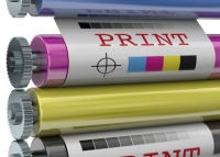
CMYK (cyan, magenta, yellow & black) is often called a 4 colour process, as a percentage of each ink colour is mixed together (on the press) to produce the final image.

Tip! If you are working with images that have been supplied to you by your client, ensure they are all one type, i.e. all RGB or all CMYK. Do not mix both types together in a litho print job, as it’s quite possible that the RGB images will go missing. Obviously, if they’re all RGB then these will need converting to CMYK which is easily done in Photoshop:
Image > Mode > select CMYK

File Types

Many web designers create their graphics in a package such as Adobe Fireworks, which is a terrific piece of software however not great for print output. The .png file type, although widely used in web design creates lots of problems when trying to convert this to a suitable format in print, the main issue being the 72dpi resolution mentioned earlier.

2. Spot Colours or Process Colours (CMYK)

I won’t repeat what I’ve already written so if you need an explanation of the differences between spot & process colours then please follow this link:

Spot & Process Colours explained.

Suffice to say it’s essential you grasp the main points about spot & process colours, as not every client wants their job done in a 4 colour process. Many companies have a ‘house colour(s)’ so working accurately in spot colour is very important.

Converting Spot Colour to CMYK

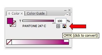
If you are working in CMYK, make sure any spot colours you’ve selected are converted to CMYK before sending the file.
We regularly receive artwork with a mixture of CMYK and spot colours so you need to tread carefully. Also make sure the printer you will be using ‘flightchecks’ your files, before sending to print.

3. Crop Marks & Bleeds

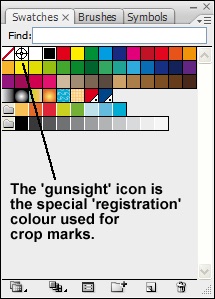
Crop marks as you probably already know, are the corner marks that indicate where the job is to be trimmed. It’s important these are always included with any artwork you send out. The special colour ‘registration’ should be used for crop marks, as it prints on every plate automatically. This is usually indicated by a ‘crosshair’ or ‘gunsight’ icon, as below. If your software can automatically generate crop marks then these will be the ‘registration’ colour by default.

Web to print design

Bleeds refer to artwork that extends over the edge of a job. Most printers require that you extend the artwork by 3mm over the edge of the job, so a clean cut can be made through the artwork. More info on bleeds here:

4. Software

The above are the main issues I come across however, it’s worth saying a little about the software options available.

If you want to get into print design then I would say the bare minimum would be a vectored illustration package such as Adobe Illustrator® and a pixel-based program such as Adobe Photoshop®.

If the budget stretches to it, and you potentially see enough print work coming in, then I would strongly recommend you get hold of a page-layout program such as Adobe In-Design® or Quark Xpress® as this type of program makes working so much easier and quicker.

In-Design integrates beautifully with Illustrator & Photoshop with the added bonus of Adobe Bridge®, which makes managing graphics much easier.

In-Design’s inbuilt flightchecking is another pair of eyes that will also help to ensure you have everything ready to send to the printers.

Related Posts

  • Website Design

Filed Under: Articles & Tutorials Tagged With: print design, web design, web vs print design

Leave a Reply Cancel reply

Your email address will not be published. Required fields are marked *

Useful Site Links

Paper Sizes UK
Envelope Sizes UK
Glossary of Print Terms UK
Spot & Process Colours Explained
Legal Requirements - Stationery
Copyright Information
Trade Printing Service

Search the Site

Copyright © 2021 Castle Print & Design - all rights reserved

Bleeds explained

Basically, a bleed is artwork that goes over the edge of the printed sheet.

If your design needs to have a bleed then it’s important to allow 3mm overlap (see image A below). As the letterhead will be printed on oversize material (SRA4), this gives the guillotine operator a chance to cut into the artwork and produce a good finished letterhead. (see image B below).

A
How to design a letterhead fig. 3
B
How to design a letterhead fig. 4

Why do we need a bleed?

If the artwork ended at the edge of the sheet and the guillotine cut was only 0.5mm out, then we could end up with an unsightly thin white strip down one edge of the sheet, which is not ideal.

Also, if there is a large stack of paper on the press, with the best will in the world there will be the odd sheet that doesn’t get fed through the press 100% accurately so if a bleed hasn’t been put in place this could cause issues.

Extending the artwork over the edge of the sheet allows for a little leeway when it comes to the time for trimming.

If you’ve set your workspace for A4 and intend to use bleeds then, depending on what software package you are using you may need to set the workspace to oversize A4 (SRA4), which measures 225mm x 320mm.

We use cookies to ensure that we give you the best experience on our website. If you continue to use this site we will assume that you are happy with it.Ok