Brochures
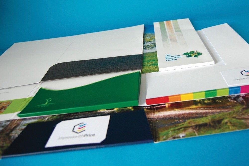
Brochures come in a variety of sizes, shapes, materials and finishing options.
As with buying white goods for instance, there are many ‘box-shifters’ in our industry also, who operate by getting work in and out of the door as quickly as possible, with no thought of whether the client is getting the ‘right’ product.
Taking printed stationery in general, brochures can be one of the most expensive items you ever purchase so it is particularly important you choose the right supplier.
- One who will spend the time and talk you through the various options.
- One who will advise on how to keep costs to a minimum.
- One who will go the extra mile to make sure you get exactly what you asked for.
- One who will advise on the various options relating to materials, ink colours, special effects etc.
If you are thinking of a brochure then remember, whatever you can supply yourself, whether it be typewritten copy, high-resolution pics or even an idea of how you wish the brochure to be laid out, can help save you money on artwork costs.
Leaflets / Flyers
Please be aware that brochures & folders are subject to VAT, however flyers & leaflets are generally free of VAT.
Flyers are generally printed on card whereas Leaflets are produced on paper stock.
Folders & Cutting Guides
Folders are printed on a large flat sheet and trimmed using a cutting guide.
If you can choose from a standard guide, this will save you money.
See here for Printed Folders options.
Brochure FAQ’s
Can you explain what you mean about spot colour and process colours?
Will the colour(s) I see on a PDF proof print exactly as I see them onscreen?
Generally, no! Some colours are fairly representative whereas others are a long way off. The monitor you view your proof on is a device that mixes colours using red, green and blue (RGB). Without getting too technical, if your monitor has not been calibrated to display a Pantone® colour, then it’s unlikely you will see an accurate representation.
If choosing one or more specific spot colours (for branding purposes etc.) then it’s essential the colours are chosen from a printed Pantone® swatch, unless you know your screen is accurately calibrated.
An example – if you were to select Pantone® Violet in your graphics program, it’s very likely that this will show as a ‘blue’ onscreen. If you were then to look at Pantone® Violet in a Pantone® swatch you’ll see that the true colour is actually a rich purple. It follows that if you’d selected this colour for your design from what you see onscreen (blue), then it’s very likely that you won’t be happy with the final printed results (purple).


