Castle Print & Design

Commercial printing for businesses throughout the UK & Europe.

  • E-mail
  • Facebook
  • business-cards-icons-Bonne Maman Logo
  • business-cards-icons-Ecover_logo
  • business-cards-icons-EPC_logo
  • business-cards-icons-FF-logo
  • business-cards-icons-halle-logo
  • business-cards-icons-harley
  • business-cards-icons-Hipp
  • business-cards-icons-HMV
  • business-cards-icons-jet2
  • business-cards-icons-LIB
  • business-cards-icons-Littlewoods
  • business-cards-icons-Marks__and__Spencer
  • business-cards-icons-marley
  • business-cards-icons-Mencap
  • business-cards-icons-NHS
  • business-cards-icons-RD_LOGO
  • business-cards-icons-samsung
  • business-cards-icons-Seat
  • business-cards-icons-Tesco
  • business-cards-icons-The_Open_University
  • business-cards-icons-thyssen-krupp
  • business-cards-icons-vbulletin
  • business-cards-icons-Vodafone
  • Home
  • Select A Product
    • Booklet Printing
    • Brochures & Leaflets
    • BUSINESS CARDS >> select for more options
      • Shaped Business Cards (die cut)
      • Laminated Business Cards
      • Spot Colour Business Cards
      • Spot UV Business Cards
      • Thermo Business Cards
    • Canvas Prints by Migglet
    • Continuous Stationery
    • Digital Printing Service
    • Envelope Printing
    • Folder Printing
    • Forms Printing (NCR)
    • Label / Sticker Printing
    • Letterhead Printing
    • Wedding Stationery
  • Other site info
    • About Us
    • Artwork & Design
    • Copyright Information
    • Envelope Sizes UK
    • FAQ’s
      • Artwork – FAQ’s
      • Business Cards – FAQ’s
      • General – FAQ’s
    • Glossary of Printing Terms UK
    • Legal requirements for your stationery – Page 1
      • Legal requirements for your stationery – page 2
    • Paper Sizes UK
    • Privacy
    • Setting up your office to use continuous forms
    • Sitemap
    • Stock Photos
    • Trade Printing
    • Write For Us
  • Articles & Tutorials
    • PRINT ARTICLES >>
      • 11 Benefits of Online Printing Services
      • Are Your Labels Selling Your Brand?
      • Booklet Printing & Publishing | Booklet Planning
      • Building Business Presence with Digital Printing
      • Business Brochure Printing: Picking The Perfect Paper
      • Choosing The Right Business Card Material
      • Colour Issues | Working in Spot & Process Colour
      • Digital, or Litho – How Do I Choose?
      • Fonts & Typefaces Explained
      • Free Business Cards – a bargain right?
      • How To Apply Printed Vinyl | Wet & Dry Methods
      • How to Design and Print Your Own Business Card Using ‘Pages’
      • How to Design a Photo ID Card that Reduces Card Cloning Attempts
      • How Visual Retail Merchandising Catches Your Attention in 2018
      • Logo Design
      • Print vs Digital Media – The Death of Print?
      • Print Technology
      • Proof That Print Is Not Dead | Most Consumers Still Prefer Print on Paper
      • QR Code Printing
      • Rich Black Explained | Using Rich Blacks In Your Artwork
      • Setting Up Your Office To Use Continuous Forms
      • Spot and Process Colours Explained
      • Thermo Process Explained
      • Understanding The Importance of Business Printing For Brand Promotion
      • Website Design
      • Web Design to Print Design – Making The Transition
      • What Makes A Logo Stand The Test of Time?
    • PRINT TUTORIALS >>
      • How To Design A Ghost Image
      • How To Design An A4 Folded Leaflet
      • How to Design a Business Card
      • How to design a Letterhead
      • Preparing A Print File In Adobe In-Design
      • How To Design A Pull Up Banner In Adobe InDesign
      • Text to Outlines – how to convert text into outlines
    • PHOTOSHOP HOW TO >>
      • How to Design an Alien Head Logo
      • How To Design A Pencil
      • How To Create Metal Text With Bloodstain Effect
      • How To Create Rusty Text with Holes
      • How to create Glossy Buttons
      • How to create a simple, clean content box
      • How To Preserve Spot Colours in Photoshop
      • How to create a Disney Navigation Interface Design
      • How To Design Custom Fitted Logos
      • How to create a Futuristic Logo Design
      • How to Design a Metallic Content Box
      • How to create a Clipboard Design
      • How to create an Industrial Text Effect
      • How to create an iRiver design
      • How to create a Professional Blog Template Design
      • How to create a Robot Head design
    • REVIEWS >>
      • Buying & Selling Art | ArtShowcase Review
      • Top 10 Best All In One Laser Multi-Function Printers
Home Articles & Tutorials How to design a Ghost Image

August 14, 2015 By castle Leave a Comment

How to design a Ghost Image

Ghost image letterhead - 5

A feint (ghost) image can be a great way to make your business stationery stand out from the crowd. Whatever type of business you run, from a one-man-band to a large multi-national, a ghost image will work with any style of business.

The usual method is to use part or all of your existing logo however, depending on the design of your logo, this may not be suitable and you may need to source a different image. For instance, we named our company after a well-known nearby castle (Donnington) which makes a perfect ghost image.

Image resolution isn’t too much of a concern when dealing with a ghost image, as it will be printed down very lightly, and consequently much of the fine detail will be unseen which is good news, as generally the image we use will be enlarged considerably.

An effective way to use your ghost image is for it to ‘bleed’ over one or more edges of your paper or card. See here for more info on creating bleeds in your artwork . . .

Time needed: 25 minutes.

  1. Getting started with ‘ghosting’ – what type of image do I use?

    Tiffs, jpegs etc. if possible try and use 300dpi images but don’t worry too much if you only have a low resolution web image (usually 72dpi) as these can often still be used for a ghost image without the lower resolution being noticeable.

    Vectored images, such as .eps .ai etc. are perfect for a ghost image due to the fact they can be enlarged to any size without loss of quality however, as mentioned above the quality of the image is sometimes not too important. In some cases, a slightly blurry image works better than a pin sharp vectored one.

    There are a number of ways we can use a ghost image but for our purposes we’ll just use a single colour version.

  2. Preparing your ghost image.

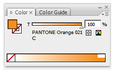
    If your business stationery is produced using spot colours, as opposed to CMYK, then you need to choose which spot colour you will be using for the ghost image.

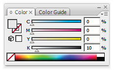
    Let’s assume the ghost image will just be using the colour black, which means when it’s printed it will look a very light grey. To achieve this entails converting the image from 100% black to between 5 & 10%.

    As there are so many imaging systems around such as computer to plate, film-based imagesetters, digital platemaking etc. it’s important to check with your preferred print supplier on what percentage you should use for your ghost image. They will be able to advise what works best for their system. Too light, and the image just looks washed out. Too dark, we then run the risk of any content you add not being suitably legible e.g. overprinting through your inkjet/laser printer.

    Bear in mind certain colours may not be suitable for your needs, e.g. 100% red when converted to a 5% tint may look more pink than red. If you’re not sure, then ask your print supplier for advice.

    Raster greyscale images such as jpegs, tiffs etc. can be converted to the desired percentage directly in your page layout program e.g. Quark XPress, Adobe InDesign. If you don’t own this type of program then the image will need to be loaded into a pixel-editing program such as Adobe Photoshop (any version, ‘Lite’ etc.)

    If the original image is a colour one for instance then you’ll first need to convert this to greyscale. Mode > Greyscale. Don’t forget to give this image a different name so you don’t overwrite your original.

    At this stage you may decide to enlarge the image, especially if it’s to be used on an A4 letterhead however, I prefer to scale the image in my page layout program.

    Working with vector images is just as straightforward. Simply load the image into Adobe Illustrator or similar vector imaging program and, after making sure all colours have been changed to black, adjust the opacity or transparency to your desired percentage. Save the file with a different name and it is now ready to drop into your letterhead artwork, or compliment slip, business card, invoices, credit notes etc.

  3. Positioning the ghost image in your artwork.

    If the image is going to ‘bleed’ off the edge of the page then make sure this does so by at least 3mm. Experiment with the image in different positions and sizes until you find one that works well.

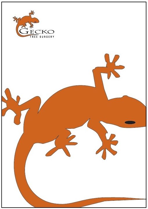
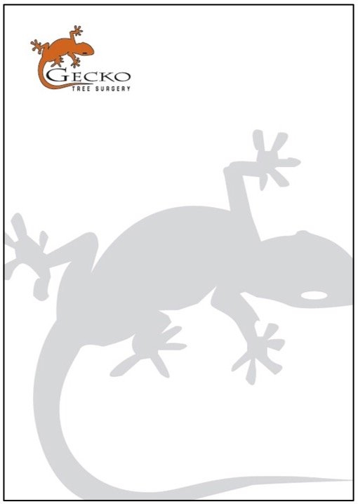
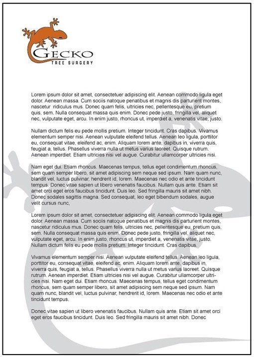
    If the image is being used on a letterhead then it follows that the end user will be adding content, so consider placing some dummy content over your ghost image to get a feel for the finished product. (Don’t forget to remove it though before sending the file to your print supplier!)

  4. We start by placing the logo in a logical spot.


    Ghost image letterhead - 1

  5. Next we copy and paste the part of the logo we shall use for the ghost image and position it.


    Ghost image letterhead - 2

  6. Remove any outlines if necessary so we’re left with a single colour object.


    Ghost image letterhead - 3

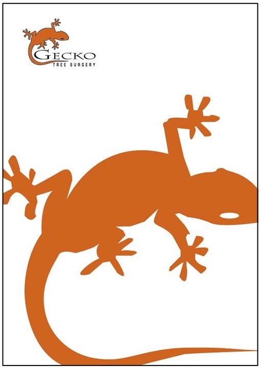
  7. Now convert the image to between 5% & 10% of Black. Creating a 10% tint of the orange colour may look a little OTT so I’ve decided to use black as our ghost image colour.

    ghost image 7

  8. Orange colour now 10% of black.

    ghost image 6

  9. Final look


    Ghost image letterhead - 5

  10. To see how the finished sheet may look place some dummy text above the ghost image.


    Ghost image letterhead - 4
    If sending the completed file to your print supplier, make sure you add crop marks which are particularly important when using ‘bleeds’.

    What if I don’t know my print supplier’s recommended percentage?
    In this case, err on the light side (5% for instance). Better slightly too light than too dark. Remember, the ghost image is just an effect, and doesn’t need to compete with other elements on your page. I’ve used a 10% tint in the above example. However, this is just for our purposes here. Normally something lighter around the 5% mark would be better.

    Using ghost images in other ways.
    Our example above is using a simple 1 colour image converted from 100% black to a 5% ghost image. If your business stationery is printed using spot colours then the same procedure is used, substituting each spot colour for its tinted equivalent.

    Full colour images, photographs for instance, can also be used as background ghost images. These work best when they ‘bleed’ over all 4 sides of the paper or board you are printing.

    Ghost images can work great as backgrounds to letterheads, leaflets, flyers, brochures, continuous forms, multi-part sets plus many other printed products.

Related Posts

  • How to design a Letterhead
  • How to Design a Business Card
  • Text to Outlines – how to convert text into outlines
  • Rich Black explained, and when to use it.
  • How to design an A4 folded leaflet
  • How to Design and Print Your Own Business Card Using Pages

Filed Under: Articles & Tutorials Tagged With: ghost image, ghosting, how to design a ghost image, tint

Leave a Reply Cancel reply

Your email address will not be published. Required fields are marked *

Useful Site Links

Paper Sizes UK
Envelope Sizes UK
Glossary of Print Terms UK
Spot & Process Colours Explained
Legal Requirements - Stationery
Copyright Information
Trade Printing Service

Search the Site

Copyright © 2021 Castle Print & Design - all rights reserved

Bleeds explained

Basically, a bleed is artwork that goes over the edge of the printed sheet.

If your design needs to have a bleed then it’s important to allow 3mm overlap (see image A below). As the letterhead will be printed on oversize material (SRA4), this gives the guillotine operator a chance to cut into the artwork and produce a good finished letterhead. (see image B below).

A
How to design a letterhead fig. 3
B
How to design a letterhead fig. 4

Why do we need a bleed?

If the artwork ended at the edge of the sheet and the guillotine cut was only 0.5mm out, then we could end up with an unsightly thin white strip down one edge of the sheet, which is not ideal.

Also, if there is a large stack of paper on the press, with the best will in the world there will be the odd sheet that doesn’t get fed through the press 100% accurately so if a bleed hasn’t been put in place this could cause issues.

Extending the artwork over the edge of the sheet allows for a little leeway when it comes to the time for trimming.

If you’ve set your workspace for A4 and intend to use bleeds then, depending on what software package you are using you may need to set the workspace to oversize A4 (SRA4), which measures 225mm x 320mm.

We use cookies to ensure that we give you the best experience on our website. If you continue to use this site we will assume that you are happy with it.Ok