
Materials used for printing absorb ink at different rates. A standard 120gsm letterhead stock is more absorbant than say a business card board, where the ink tends to ‘sit’ on the surface.
Gloss materials, or coated stock also provide a good base for inks to sit and have the added benefit of reflecting light back through the ink, making the artwork look punchier.
The effect is even more profound on laminated business cards, and the plastic laminate again helps to reflect light and consequently enhance the artwork.
 Materials used for letterheads, compliment slips, invoices (NCR, or no carbon required) however are much more absorbant, and colours (ink) tend to soak into the material, often leaving them with a slightly washed-out effect.
On a 2 colour press, let’s say we have red and black being printed on a letterhead. The machine operator can control the pressure of the individual ink rollers and control the flow of ink onto the paper. So, if the black looks a little weak he can apply more roller pressure to give a denser black print.
Ok, so far so good.
Now if we switch to a different situation where we need to print a letterhead using a 4 colour (CMYK) process then things aren’t so straightforward.
Ok, we’re now using a 4 colour press, and we have a letterhead that has a couple of full colour (CMYK) trade logos for example plus the usual text printed in black.
Although the press operator still has total control over each of the 4 printing units, he has to take much more care. As all the colours on the letterhead are being printed using a combination of Cyan, Magenta, Yellow & Black should the press operator decide to put the black down stronger (to give more impact to the text) then all the other elements on the page will also be affected by this adjustment (as a percentage of black will also be used in the other colours) and things will rapidly start to look out of balance. This means his options are pretty limited.
Now it’s natural to assume (and this is a common mistake) that when creating the artwork we select 100% black (see fig. 1 below) and no other colour, for our text on the letterhead.
Unfortunately, this will leave our black text looking washed-out, or look as though it’s been printed in a dark grey. On seeing this, the end user may rush to the phone and complain to the printer of ‘bad print’, or a similar phrase not repeatable here!
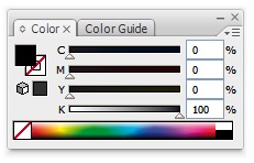
fig. 1
This is exactly where we need a ‘rich black‘, or a black that has other colour added to it to give a denser effect.
Rich Black
So, what combination in percentages of colour do we use? Well, it’s probably best you check with your preferred printer and ask what values you should use to create a rich black for his system.
Some will tell you to use 100% black, and 65% of all other colours as below:.
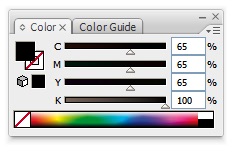
fig. 2
We also get good rich black results from using 100% of all 4 colours, as below:
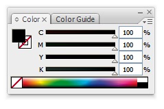
fig. 3
Using just 100% black in a 4 colour job is an easy mistake to make, especially as a monitor won’t show you what really happens to ink once it hits the paper.
One thing worth pointing out . . . you won’t be able to see any difference onscreen between a regular black and rich black, but when the job gets to print, then the difference will be more obvious.
If you’re interested in learning how to create ‘warm’ and ‘cool’ blacks in your artwork (using different colour combinations) then see this informative page at Wikipedia.
We hope the above has helped in some way.
Leave a Reply