To quickly find the product, article, tutorial or other site info you require, please use the search facility below.
If your enquiry is urgent, we can quickly be contacted on:
01635 255 552
Extra info
If you are sending in a pdf, and not sure how to convert all text (fonts) into outlines, then please include the font details in your email and whether the design was done on a PC or Mac. Most printers use both systems but often the fonts, although sharing the same name, can be slightly different, especially with issues such as letter spacing (kerning).
= = = = = = =
Spot colours or process
If you are not sure if you should be using spot colours in your artwork, or CMYK (process colours), then check out this info on Spot vs. Process Colours.
This tutorial is aimed at helping you position your artwork so it can be correctly folded. Dividing an A4 sheet into 3 equal parts will not give you the correct folds, as we need to allow room for the front cover to overlap the other parts.
(1). Turn on rulers in your design package (often Ctrl. R), and set the top left hand corner to: x = 0, y = 0. This will help you to position the margin guides.
(2). Start by setting your workspace to A4 and position your non-printing guides as shown in the diagram below. These guides are where you want the job to be folded.
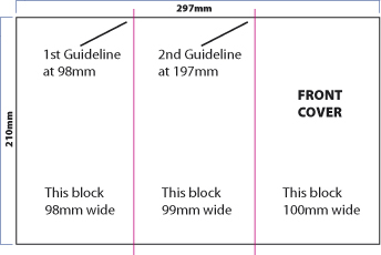
Tip. If you're not familiar with using rulers, then simply create a picture or text box 98mm wide and position the left edge to your workspace. You can then draw a guide down the right hand side of this box. Repeat this process with a box of 99mm width for your 2nd guide. The remaining space should then measure 100mm.
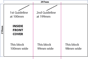
For the inside of the leaflet, it's just a case of reversing the measurements.
The left hand block, which now becomes the inside of the front cover, (see below), will measure 100mm. The centre block will measure 99mm, leaving the final block on the right hand side as 98mm.
Margins: to get a neat, professional-looking job it's important to use margins. Depending on how much content you have then a good starting point is to use 10mm margins. Use more guides to show the margins, as in below. Start by having a 10mm margin around the whole of the A4 sheet and then position further 10mm margins before and after your guidelines.
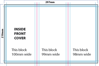
We now have a 10mm margin around the whole of our A4 sheet, plus the same margin either side of the guidelines.
Don't forget to add your margins to the front of your leaflet.
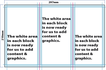
You are now ready to add content to both sides of your leaflet.
Many artworkers will position short dotted lines, just above and below the artwork, to mark the position of the folds.
Hope this helps!
However, if any points need clarification or you just need a little assistance please don't hesitate to contact us, and we'll do our best to help.
CONTACT US HERE WITH YOUR
PRINTING QUERY OR FOR REQUESTING SAMPLES We will deal with your enquiry as soon as possible
You can also call us on: 01635 255 552
If you've enjoyed reading the above article, or it's been helpful to you I'd really appreciate a link back to it from your blog or website, as every little link helps!
Here are some details to help make the job easier for you . . .
Title = Designing a Folded A4 Leaflet
Description = An easy-to-follow article that explains how to correctly set up your leaflet so it is correctly folded.
If you don't want to link to the above article but still found it helpful it would be greatly appreciated if you could leave a comment in the box below. Please let me know if you found the article easy to follow, or if you thought it was lacking in information as this will help me with ones I have planned for the future.
How to design and plan an A4 leaflet/flyer for folding.
Design info
Would you like to be notified when a new print & design related article is uploaded?
We respect your email privacy Under no circumstances will your email address be used for any purpose other than to notify you when a new article has been uploaded.
We will not bombard you with 'special offers', or any other marketing promos.
Designing a Letterhead
An easy to follow tutorial on designing your letterhead.
read more
Common leaflet design problems.
Margins - many designs that are sent in to us have the text far too close to the edge of the leaflet. Using a 10mm margin all around the leaflet will help to give you a clean, professional look to your leaflet.
Guidelines - are particularly important especially if a graphic, or photograph has been used to cover the whole of the front cover, but no other part of the leaflet. A correct folding position means the edge of the graphic will be directly on the fold position, and not creep over to the centre block.
= = = = = = =
Fonts - if possible, try not to use more than 2 fonts in your design. Often, using just one font will do the trick. For instance, if your company name is Acme Autos and you have this in a bold sans-serif font such as Ariel Bold, then try using Ariel light, or regular for all the other info on the card.
If your headline (company name) is in a bold serif font, such as Times Roman Bold, then if going for a traditional look use a lighter weight of Times for the other info, or even try using a light sans serif font to compliment the headline.