
Colour Issues
Achieving colour consistency across your stationery and promotional items
 This section has been included to help explain the many colour issues that can crop up when trying to achieve colour consistency across your stationery and promotional items, such as:
Brochures, letterheads, business cards, signage, printed clothing, CD/DVD covers, exhibition materials etc.
Spot colour is also covered in this section.
A simplified explanation of the difference between spot & process colours can be seen here: Spot Colours Explained
If your stationery looks as though it has been produced by mutliple suppliers, or if you are buying print for the first time and want to understand the colour basics, then please read on.
The following information relates to ‘lithographic printing‘, (or just ‘litho‘) which is just a fancy phrase to describe the process of printing, using inks on a standard printing press. Many short-run items these days are produced using a digital format which is a totally different process, and not to be confused with the ‘litho’ information below.
There are 2 main processes.
Spot Colour, and Process Colour (often described as CMYK or just Full-Colour).
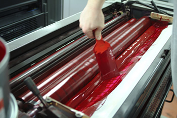
Spot Colour Printing
A good analogy is buying paint in your local DIY store. A colour ‘swatch’ is provided whereby you make your selection and the store can supply a pre-mixed colour that’s displayed on the swatch. If you were after a colour that isn’t on the swatch then the store can do a special mix to achieve the colour you are seeking.
The same process is used in spot colour lithographic printing. The industry-standard colour reference is Pantone©.
So for instance, if you choose Pantone© 286 this is a Royal Blue. Pantone© 485 is deep red, and so on.
As with the paint analogy, Pantone colours can be adjusted to match a particular shade.
More on spot colours here: Spot Colours Explained
Spot colour problems
If you choose one of the standard Pantone© colours then generally, there should not be any problems. However, printing the colour on different substrates, such as business cards, letterheads, NCR (Invoices etc.) can show some variation in the colour.
This is mainly due to a couple of reasons: the materials will have different absorbancy properties and they may also have slightly different shades. 100gsm Conqueror© hi-white wove for instance, is a slightly creamy colour, whereas a standard 335gsm hi-white business card is much whiter, so consequently the colour may look slightly different on the two products. Plus, the ink will ‘sit’ on the card, whereas the ink on the letterhead will tend to soak in slightly.
However, even taking the above possible issues into consideration, printing using the Pantone© reference is still the most reliable way of achieving colour consistency.
CMYK – Process Colour Printing
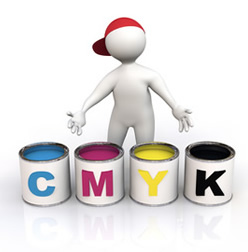 Where spot colours cannot be used, (a colour photograph for instance), then CMYK would be used.
Cyan, Magenta, Yellow and Black inks are mixed together to achieve the final result.
Any spot colour can be converted to CMYK and produced using this method (although with caveats, as we will see).
At this stage it’s worth mentioning how a printing press would be set up for both the above processes as this will explain why some commercial printers favour one process over another.
Spot Colour press
A 1 colour press has 1 printing unit.
A 2 colour press has 2 printing units.
A 3 colour press is not economical, so we would jump straight to a 4 colour press, which obviously has 4 printing units.
Let’s assume you have a 2 colour letterhead, using the following Pantone© colours: 281 (dark blue) + 032 (pillar-box red).
The operator using the 2 colour press would have to ink one unit with 281 and ink the other unit with 032. A certain amount of material would be wasted getting the inks up-to-strength before the job could be started.
Once this job has been completed the operator may then have another job requiring 2 totally different colours. The ink units would both need to be washed down, before the new inks were introduced, and then the same process would happen where the inks need to be brought up to full strength.
As you can see, this is quite labour-intensive and in fact, most of the costs involved with short-run printing goes on the press set-up time.
CMYK press
A standard 4 colour press would have 4 printing units, however many larger presses utilise more units, which can be used for adding a particular spot colour, or UV varnish etc.
The operator using the 4 colour press would ink the 4 units using Cyan, Magenta, Yellow & Black. For our purposes, let’s say he has 6 different full-colour business card jobs to produce.
Once the inks are brought up to strength, each job can be passed through the press with no washdown involved, as they all use the same inks. To streamline this process even further, the guys in the repro studio would ‘plan’ the 6 jobs on one large sheet. This means the press operator can run all 6 jobs in one go.
This begs the question: why isn’t CMYK printing cheaper than using the 2 spot colour method? The reason is the costs involved. A 4 colour press is far more expensive than a 2 colour. Also, a 4 colour press operator is a highly-skilled operative so we also have a higher salary to consider.
Ok, we’ve seen how both processes work, now to the nitty gritty. The one main problem with converting spot colours to CMYK is that quite often, the CMYK version will look different to the spot colour version.
There are certain colours that will cause more problems than others. Pantone© 021 (Orange) for instance, will look Brown when converted to CMYK.
Now, if all your stationery is being produced in CMYK then generally there is not a problem.
The problems begin when part of the stationery, (business cards for instance) is produced in CMYK and other items, (letterheads etc.) are produced in spot colour.
The spot colour version will be more accurate (colour-wise) than the CMYK equivalent.
So, unless steps are taken, it’s possible that you could end up with cards and letterheads looking like they’ve been produced in different colours, which is not ideal!
Tips to help overcome this issue
The following is based on a typical scenario of an order comprising 2 colour letterheads, business cards & compliment slips.
1. Is there any part of your order that you would require to be printed in CMYK?
For instance, the business card may have a large ink coverage on one side and the printer has advised that the cards would need laminating (to protect from ink-smudging) and that for cost reasons, this would need to be produced in CMYK.
If so, then I would recommend, providing the timescale is not critical, that you ask your printer to produce the cards first, and then match the spot colour work (letterheads & comp. slips) to the finished card colour.
2. I’m having laminated cards printed (in CMYK) but may want some other stationery at a later date.
Just make sure whoever prints the rest of your stationery is sent a sample of your card to match to. If you’re happy with the colour on your card just send that, and do not provide a Pantone© reference. This may just confuse the issue.
3. My corporate colour is critical and I do not want any colour variation.
Then your stationery needs to be produced in spot colour only. Check with your printer as there may be some cost considerations involved.
Also, make sure the colour you have chosen is from a Pantone© swatch, and not a colour you have seen on a computer moniter. A monitor displays colour in RGB (Red, Green & Blue) format and, unless it is calibrated to a Pantone© system, will not show you an accurate colour.
Tip! If there is a particular colour you like, and you don’t have access to a Pantone© swatch, try and print it to your desktop inkjet/laser. If it looks correct on the printout, send this sheet to your print supplier for matching to. Make sure you use a largish block of colour on this sample.
4. My designer is producing artwork for my new stationery. Is there anything I need to ask him/her about the design that could cause a colour issue?
Will there be more than 2 colours involved? If so, will all items need printing in CMYK? If so, get prices from your print supplier before signing off the artwork, as you may decide to cut costs and have it produced in 1 or 2 colours.
Is there a colour photograph, or a large area of ink coverage?
It’s worth remembering that many designers have come from a web design background and will not have the necessary knowledge when dealing with print-related issues.
If you are in any doubt with the answers receieved from your designer, then contact the print supplier and discuss it with someone who is in charge of the studio/artwork department. If they refuse to help you – change your supplier!!
Ok, we’ve sorted the stationery out but what about my other promotional items such as signage, printed clothing, CD/DVD covers, exhibition materials, vehicle livery, digital posters etc. etc.
It’s always easier to get your stationery sorted first, as it becomes quite difficult to match to vynil that is already on a vehicle for instance.
As with the suggestions above, always supply a printed sample of the colour you need to achieve.
Due to the various other print processes involved, screen-printing, digital-printing etc. you are never going to have a ‘perfect set’ of stationery/promotional items, but by keeping your eye on things you can certainly get very close.
Many of the above suggestions are particularly relevant to start-up businesses who often have no experience of buying print and are consequently quite vulnerable.
The main points to remember are:
- If you are designing your own artwork, call your print-supplier and check with them that what you’re doing will be workable. Tell them what program you will be using and remember to steer away from low-resolution graphics, especially ones sourced from the internet. The exception to this is Stock Photo sites, who generally carry photographs in different resolutions, depending on your needs.
- If you are employing a designer, ask him/her to explain how each job will be produced. If you cannot get a suitable answer call your print supplier for help.
- If none of the above makes any sense don’t worry, just call your print supplier and get the advice you need. It could save you a lot of money and heartache in the future!
We hope the above has proved useful to you and should you have any queries that haven’t been covered here, we will be only too happy to assist.

Leave a Reply