
Spot Colours
Spot colours are the preferred method of producing stationery inexpensively, and also the method used where colour accuracy is deemed essential, for instance a company logo.
The standard reference guide to spot colour work in the UK is Pantone®.
Basically, an ink colour is ready-mixed to produce a particular colour, as in Pantone® 032 below.

Pantone 032
So if you were producing a 2 colour card with, for instance, Black as the main colour for text then a 2nd Pantone® colour would be chosen from a colour swatch.
To produce this job would entail making 2 sheets of film which would then be used to make 2 printing plates for the press.
The more spot colours used, the more film and plates are needed, hence the increased costs.
To keep costs down it’s possible to create tints of a spot colour without needing extra film or plates. The example (shown below) consists of Pantone® 032 at: 100% + 50% + 25%.
These 3 ‘shades’ would all be on 1 piece of film & 1 plate.

032 at 100%

032 at 50%

032 at 25%
So, just for example, say we have a 2 colour leaflet to produce. Using the 2 colours plus variations in tint strength we can still end up with a very colourful job, without having to go the 4 colour route, which could prove to be too expensive.
Tip! To create a ‘ghost’ image of your logo in the background of your business card, letterhead etc. change all values to between 5% & 10%.
To learn more about this effect, see this article How to Design a Ghost Image
Process Colours
a.k.a. 4 colour process, or CMYK, Process colours are normally used where continuous tones (as in photographs) are required. The primary colours Cyan, Magenta & Yellow are mixed with Black to produce the full range of colours.
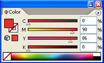
For instance, if we needed to produce the Pantone® 032 colour above using a 4 colour process, the ‘split’ would be:
Cyan = 0% – Magenta = 90% – Yellow = 86% – Black = 0%
As a separate piece of film and plate is produced for each of the 4 colours this adds heavily to the cost compared to printing in spot colours.
Some spot colours lend themselves perfectly to being reproduced using the 4 colour process, whereas others can cause slight problems in that the match is not perfect.
This is a very general outline of the 2 processes.
See here for a more in-depth article relating to – colour issues
Problems producing stationery using both spot and process colours
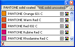
Let’s say your company design uses 2 colours: Pantone 021 (Orange) and Black.
Let’s also assume you require Letterheads & Business Cards.
Letterheads
The 2 colours would be set up on the press and if the orange (021) was later compared to a Pantone swatch then you would see that the match is very, very close. So far, so good.
Business Cards
You’ve decided, for whatever reason, to use a solid colour on the front or reverse of the card and you also want this
matt-laminated. Due to cost, most commercial printers (ourselves included) would produce these cards using a 4 colour process (CMYK). The reason for this is that it is too expensive to set up a printing press with 2 spot colours and then laminate these cards.
It is far more cost-effective to plan multiple card jobs together, run on one large sheet, and then laminate the whole lot as one group. As all the cards will probably have different colours the way around this is to produce them from the 4 CMYK colours, Cyan, Magenta, Yellow and Black.
However, the downside to this is that when certain spot colours are converted to CMYK, (our Orange 021 for instance), there can be a distinct colour difference due to technical problems with certain colours.
What this means is that the colour of your cards can end up being totally different from the colours on your letterheads.
Note – it is not all spot colours that convert badly to CMYK, but just some that seem to suffer from the conversion.
Workaround?
One workaround is to print the cards first, and then ‘match’ the letterheads to this colour (spot colours can easily be ‘adjusted’). The problem then is that although you end up with matching stationery, all of a sudden it’s not Pantone® Orange (021) anymore, as we’ve now matched to a CMYK colour.
If your shade of colour is critical then, unless you’ve had previous cards that are acceptable, it’s probably best to steer away from cards produced using CMYK. Do not be alarmed as this problem only applies to certain spot colours so check with your printer to see if your particular Pantone colour converts accurately to CMYK or is one that can cause issues.
We have a list of certain colours that cause problems and we would notify you during the artwork process if this was applicable to your brand colour.
To recap – if you want your card matt-laminated and also for the card to match existing stationery, then it would definitely be worth checking with us first to see if there may be any colour-matching issues.
If you are at all concerned about achieving colour consistency across all your printed products, whether stationery or promotional items please see a fuller explanation of the above issues, at this page < Everyday Colour Issues Discussed >
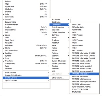
If you’re wondering how to access the colour swatches in Illustrator, well the guys at Adobe have moved it to a different part of the menu system.
Just click on: Window (in the main file menu), select: Swatch Libraries and then Colour Books.
Which swatch to use?
For our purposes, it doesn’t really matter whether you select uncoated or coated, as the material and the print process will determine which type of ink is used for your project. For instance, if you’re having some leaflets printed on gloss art paper, then the printer will use a coated ink, which has been designed to dry quickly on this type of surface.
Business cards, letterheads etc. will generally be printed using uncoated inks. I would recommend not worrying too much about this aspect, and choose a ‘regular’ colour book such as Pantone Solid Coated and stick with it for all your tasks.
The important thing to remember is to stick with one colour book on a project, i.e. don’t mix coated and uncoated or any other book in a single project.
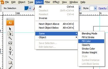
If you’re not using spot colours in your project, but have used them to select the colours you require, don’t forget to convert them all to CMYK.
This is easily done by selecting them one at a time, and then using Select > Same > Fill Colour to select all similar colours and then converting using the 4 colour icon shown below. If you don’t see this box, then hit F6 to display it.
Any spot colours left behind probably won’t print, so do make sure you’ve converted them all, including any strokes (outlines) that are in spot colours.
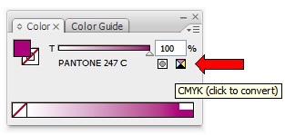
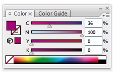
After conversion you can see that in this example, Pantone 247 is made up of 36% Cyan & 100% Magenta, with no yellow or black (K).
How do I convert a CMYK colour I’ve been given, back to its Spot Colour equivalent?
This is a question often asked!
There are a couple of options, an expensive one and another that just takes a little time.
The first option is to purchase a Pantone® swatch that shows the spot colour equivalents of CMYK ‘splits’. That’s the easy way, but for occasional use a little too expensive.
Another way is this:
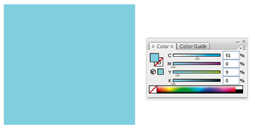
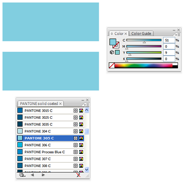
Firstly, write down the CMYK colour split you’re looking to find a spot colour equivalent for. For the purposes of this exercise, I’ve chosen the following split:
C = 51%, M = 0%, Y = 9% K = 0%
Now, draw a box in your illustration program and fill it with the above split.
Draw another box below your original and choose a colour as close as you can from the Pantone swatch of your choice. (I normally use Pantone Solid Coated). In this instance I went for Pantone 311.
With so many blues to choose from you’ll be lucky if you get really close the first time.

OK, you’ve chosen a blue and now need to convert this to CMYK in the usual way, using the 4 colour icon.

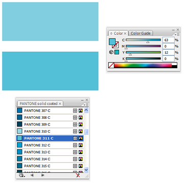
Pantone 311 has split to 63, 0, 12 & 0. Not bad, but a little on the dark side, (scary!), so we need to try another colour.
I’ve now selected Pantone 305 which looks pretty good, so again we need to convert it to CMYK. Fingers crossed.
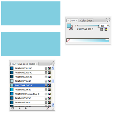
Spot on. Our 51, 0, 9, 0 split converts perfectly to Pantone 305 so we now have our working spot colour.
Hope this helps answer any questions you had on spot and process colours.
Please feel free to leave a message below.

Leave a Reply