
How to create an Industrial Text Effect
Step 1:
Let’s start out by creating a new file. I used a 500×500 pixels canvas set at 72dpi, and I filled my background with black color. Now select the Horizontal Type Tool then set the font family to Agency FB, bold, 72 pt, strong and #4E4E4E color shade. Then in a new text layer type your website name.

Step 2:
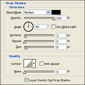
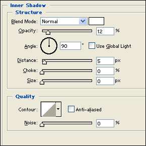
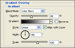
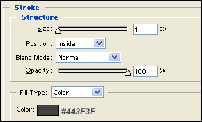
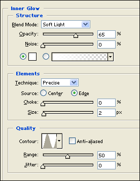
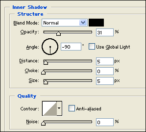
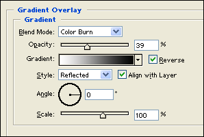
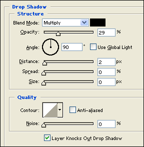
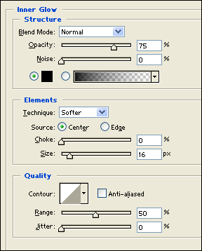
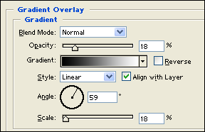
Under Layer Style(Layer > Layer Style) add a Drop Shadow, Inner Shadow, Inner Glow, Gradient Overlay and Stroke blending options to your dark gray text layer.

Result:

Step 3:
In a new text layer type out your name in white color.

Step 4:
Under Layer Style(Layer > Layer Style) add an Inner Glow blending option to your white text layer. Then set the text layer’s blending mode to Darken.
Result:

Step 5:
Make a new layer set and name it ‘Structure’. Then in a new layer draw a black spot using your brush tool with a soft brush. Now make a gray rectangle with #8C8C8C color shade and 32 x 55 px dimensions on the black spot.

Step 6:
Under Layer Style(Layer > Layer Style) add an Inner Shadow, Inner Glow and Gradient Overlay blending options to your gray rectangle layer.

Result:

Step 7:
Create a new layer then draw a gray ellipse with #8C8C8C color shade and 34 x 19 dimensions.

Step 8:
Under Layer Style(Layer > Layer Style) add a Drop Shadow, Inner Glow and Gradient Overlay lending options to your gray ellipse layer.
Result:

Step 9:
In a new layer draw a black ellipse with 22 x 13 px dimensions on top of the gray ellipse design.

Step 10:
Duplicate the ‘Structure’ layer set and merge it through Layer > Merge Layer Set. Then resize it through Edit > Transform and duplicate it again and position as shown below.

Step 11:
Now add more small structures on your text design, anywhere that fits with your text.

Results:
How to create an Industrial Text Effect

Leave a Reply