
How to create a Futuristic Logo Design
Alternatively, try out this online logo maker. So easy to design a logo.
Step 1:
Let’s start out by creating a new file. I used a 500×400 pixels canvas set at 72dpi, and I filled my background with a black color. Then create a new layer set titled ‘Logo Structure’.
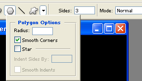
Select the Polygon Tool, under the options palette choose fill pixels with 3 sides and anti-aliased checked. Now open up the polygon options palette and check smooth corners and uncheck star setting. In a new layer draw a gray polygon with #585858 color shade and 92×90 px dimensions.

Step 2:
Go to Edit > Transform > Perspective, when the transform points appear on your shape drag the the top right point up until you get the same design as shown below.

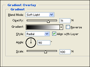
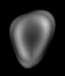
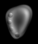
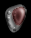
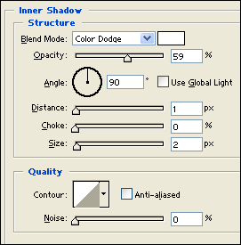
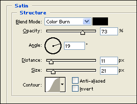
Step 3:
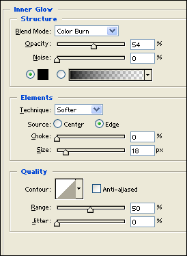
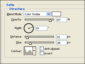
Under Layer Style(Layer > Layer Style) add an Inner Shadow, Satin and Gradient Overlay blending options to the deformed gray polygon layer.
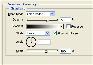
Step 4:
Create a new layer and draw a black circle with 16×16 px dimensions. Now under Layer Style(Layer > Layer Style) add a gradient overlay blending option. Then set the layer’s blending mode to Soft Light.
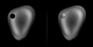
Step 5:
Duplicate the circle design layer three times and position it as shown below.
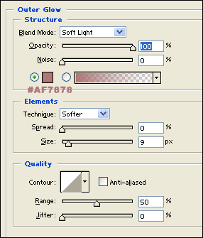
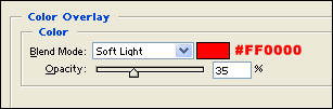
Step 6:
Duplicate the ‘Logo Structure’ layer set and go to Layer > Merge Layer Set, this should turn the duplicated layer set into a regular layer. Resize the duplicate design by 60% and position inside the original design. Then under Layer Style(Layer > Layer Style) add an Outer Glow and Color Overlay blending options.
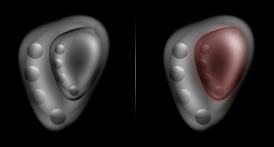
Step 7:
Place the smaller logo structure design into the ‘Logo Structure’ layer set. Then add two circle designs on the top corner of the logo design.
Step 8:
Once again duplicate your ‘Logo Structure’ layer set and merge it down. Flip the duplicate horizontal through Edit > Transform. Position it right next to the original.

Step 9:
Now duplicate the logo structure layer from step eight and resize by 50%. Then rotate it by 90 degrees CCW through Edit > Transform. Finish it off with another copy for the second structure.
Step 10:
Select the Horizontal Type Tool and set the font family to Arial Black, regular, 36 pt, strong and #C8ADAD color shade. In a new text layer type your name. Then under Layer Style(Layer > Layer Style) add an Inner Shadow and Satin blending options.

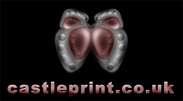
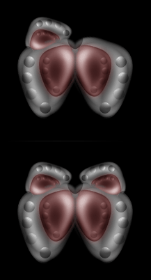
Results:
Futuristic Logo Design
Leave a Reply