
In this How to Design a Letterhead tutorial you will find it is a very straightforward process however, there are a couple of issues that need addressing before you start.
How will the letterhead be printed?
Are you printing your own letterheads, or intending to send the finished artwork to a printer? If sending to a printer, will the letterhead be produced by a traditional lithographic (printing press) process or in a digital format?
It’s important you take the above into consideration otherwise it’s possible you could be wasting your time by producing artwork in the wrong format.
Digitally-produced artwork, including inkjets/lasers etc.
From an artwork point of view, we can group digitally-printed letterheads and ones you produce yourself together.
No special consideration needs to be given to graphic file formats, or the amount of colours used. Your inkjet/laser printer is basically a cut-down version of a professional digital machine so basically, what you see onscreen generally gets printed as expected. You’ll already know that many inkjets cannot print right up the the edge of the sheet, so your artwork would need to be positioned within the margins available for your particular desktop printer.
Even print resolution is not as critical when your artwork is produced digitally. When sending files away for litho printing however, you’ll often hear that files, for best results, need a print resolution of 300dpi (dots-per-square-inch). For digital work this can often be much lower however, I wouldn’t recommend going as low as 72dpi which will look fine onscreen but will not look as sharp when printed.
Litho printing – spot colour & 4 colour process (CMYK)
We’re now in a different ball game as we need to provide artwork in the correct format, or the results may not be to your liking, or what you expected.
Spot Colours
If you’re designing a 2 colour job, e.g. dark blue & red logo, with the same dark blue for the text then don’t bother with programs such as Microsoft Word, or Adobe Photoshop. Word is fine for digital output and Photoshop is fine for 4 colour (CMYK) work.
For spot colours, the artwork you send in needs a software program to ‘separate’ the 2 colours onto 2 individual ‘plates’. (Plates are individually mounted onto a printing press).
Programs such as QuarkXpress, Adobe In-Design & Illustrator can create and separate spot colours correctly. So when asked by your printer for an EPS files (Encapsulated Postscript), he is referring to a file that can be output by one of the above programs.
For more information on working in spot colours please see here:
Spot & Process colour explained
For a fuller explanation also covering some typical everyday problems when working with colour, please see the article here:
Colour issues when working in Spot & Process colours
4 colour printing, or CMYK
The same tutorial above can be used to learn about 4 colour printing. For the layman, 4 colour work is generally just as easy as producing work for digital output. However, try not to use any imagery under 300dpi, as the high resolution output from film & plate imagesetters will show up any discrepencies in the resolution of your artwork.
For low-volume print runs generally speaking, spot colour work is cheaper than 4 colour and if colour accuracy is important, then spot colours could prove essential.
If you’re in any doubt on which process to choose, talk it through with your printer who will advise, based on the quantities you require, the most cost-effective route to take.
How to design a letterhead
Ok, the following is based on a simple letterhead design. If you are using Microsoft Word then I would suggest you keep all artwork within your printer margins, and do not have any artwork extending over the edge of the page.
Time needed: 30 minutes.
- Start by setting your workspace to A4
If you’re intending to use bleeds, (see below) then, depending on what software package you are using, you may need to set the workspace to oversize A4 (SRA4), which measures 225mm x 320mm.
A4 size is 210mm wide x 297mm deep. - Rulers
Turn on rulers in your design package (often Ctrl. R), and set the top left hand corner to: x = 0, y = 0. This will help you to position the margin guides.
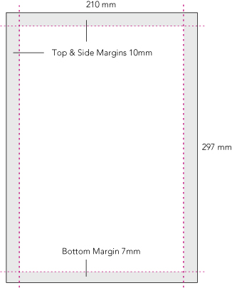
- Margins
There are no hard and fast rules when it comes to margins. Many people will just stick 10mm or 15mm all round. I prefer the bottom margin to be 7mm, especially if there are 2 or 3 lines of text, as I think it looks better.
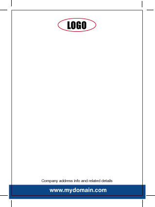
Layout: there are numerous types of layout for a letterhead design. In this instance we’re using a simple centred layout, which is very easy to create.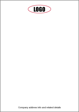
Ok, we’ve positioned the logo 10mm from the top and the address details 7mm from the bottom of the sheet. (Guides not shown for clarity).
You may need to position a vertical guideline 105mm from the left edge to give you a centre line to align the logo correctly.
Before we go any further, you may have heard the term ‘bleeds’ when reading about print files. The term is easy to understand and shouldn’t cause you any problems. - Bleeds
Basically, a bleed is artwork that goes over the edge of the printed sheet.
If your design needs to have a bleed then it’s important to allow 3mm overlap (see image A below).
As the letterhead will be printed on oversize material (SRA4), this gives the guillotine operator a chance to cut into the artwork and produce a good finished letterhead. (see image B below). - Letterhead A
- Letterhead B (after bleeds have been trimmed off)
Why do we need a bleed?
If the artwork ended at the edge of the sheet and the guillotine was only 0.5mm off, then we could end up with a thin white strip down one edge of the sheet, which looks unsightly.
Also, if there is a large stack of paper on the press, with the best will in the world there will be the odd sheet that doesn’t get fed through the press 100% accurately so if a bleed hasn’t been put in place this could cause issues.
Extending the artwork over the edge of the sheet allows for a little leeway when it comes to the time for trimming. If you’ve set your workspace for A4 and intend to use bleeds then, depending on what software package you are using you may need to set the workspace to oversize A4 (SRA4), which measures 225mm x 320mm. - Back to our letterhead (Crop Marks)
We are now ready to add ‘crop marks’, (if sending your file to a litho printer).
Crop marks, or registration marks use a special colour (registration) that appear on all plates, enabling the press operator to accurately line up the plates by overlaying one colour plate over another.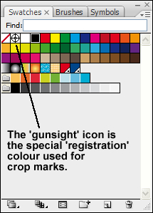
If you were adding the crop marks manually then you’d first need to select the line tool, and then the colour ‘registration‘ as indicated by the gunsight icon in the above screenshot.
Most professional layout programs however will automatically add crop marks (selectable from the menu). - Crop Marks without Bleeds

- Crop Marks with Bleeds
- Convert Fonts to Outlines
One final task is to Convert Fonts to Outlines. If you’re not sure how to do this, just check out this easy-to-follow tutorial: Converting Text to Outlines.
If you’re using a program such as Adobe In-Design, or Illustrator it is recommended you convert all text to outlines. This effectively removes the need for you to supply any fonts you’ve used.
Apart from the legal aspect, if you’ve just spent a lot of money on some real nice designer fonts, you won’t be wanting to send them out for free!
Converting fonts to outlines effectively makes the text non-editable as all the characters in the typeface become single small graphics. Before you proceed to convert to outlines, it might be worth saving the file under a different name as a backup, because once outlines have been created, the file no longer becomes editable.
With all text now converted we then proceed to make a pdf of the file. - Fonts
If possible, try not to use more than 2 fonts in your design. Often, using just one font will do the trick. For instance, if your company name is Acme Autos and you have this in a bold sans-serif font such as Ariel Bold, then try using Ariel light, or regular for all the other info on the letterhead.
If your headline (company name) is in a bold serif font, such as Times Roman Bold, then if going for a traditional look use a lighter weight of Times for the other info, or even try using a light sans serif font to compliment the headline.
More on – choosing a suitable font for your project.
We hope the above has proved to be useful.
That was quite helpful and pls add more illustrations in the explanation.