
At first glance, how to design a business card seems an easy enough task to complete as we’re only dealing with a relatively small piece of artwork however, it does need a little thought beforehand to get the results you are hoping for. A person’s business card needs to offer a positive reflection of their business. A smart, professional-looking card, printed on quality material says a lot about your company and gives the holder that extra confidence often needed at an initial sales meeting.
There are so many software packages available these days to make your task possible from semi-pro software such as: Publisher®, Word® etc. up to the high end offerings such as In-Design®, QuarkXpress®, Illustrator® & Photoshop® etc.
Whichever package you use there are certain points that must be considered before starting the work.
I would say the most important point to consider is using suitable hi-res graphics, (logos, trade logos etc.). If your artwork is pixel based, e.g. .tiff, .jpeg then ensure it is at least 300 dpi at actual size to be used.
Time needed: 30 minutes.
- Getting Started
Start by setting your workspace to A4 or A5 and drawing a box with a thin outline. (e.g. 0.5 point).
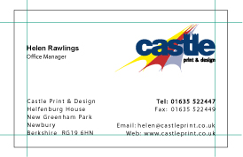
Our Standard card size is 85mm x 55mm. (Landscape or portrait).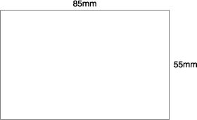
- Rulers
Turn on rulers in your design package (often Ctrl. R), and set the top left hand corner to: x = 0, y = 0. This will help you to position the margin guides.
Note: you could set your workspace to 85mm x 55mm, but I think it’s easier to visualise the finished card by viewing it on a larger sheet, so the card outline is showing.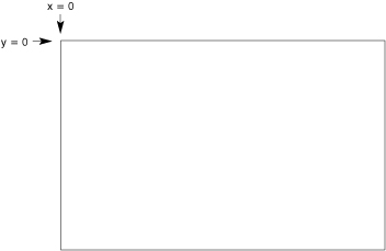
- Margins
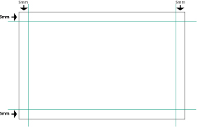
Next, set up your margin guides, preferably at 5mm. If you have very little info to go on the card, then consider using larger margins.
Before we go any further, you may have heard the term ‘bleeds‘ when reading about print files. The term is easy to understand and shouldn’t cause you any problems. - Bleeds explained
Basically, a bleed is artwork that goes over the edge of the card, or sheet if dealing with other types of stationery. (You may have noticed that many colour brochures & leaflets are printed right to the edge of the sheet).
If your design needs to have a bleed then it’s important to allow 3mm overlap (see left image below). This gives the guillotine operator a chance to cut into the artwork and produce a good finished card. (see right image).
Why do we need a bleed?
If the artwork ended at the edge of the card and the guillotine was only 0.5mm off, then we could end up with a thin white strip down one edge of the card.
Also, if you can imagine a large stack of cards sitting on the guillotine ready to be trimmed. There’ll always be the odd card that is sticking out a fraction so any artwork on that particular sheet, (and there could be 4, 8 or even 12 different card jobs on that sheet), that hasn’t allowed for bleeds could be a fraction out, giving us the white line effect mentioned above.
Extending the artwork over the edge of the card allows for a little leeway at trimming time. - Card with bleed

- Card after bleed trimmed off
- Back to our card.
We are now ready to add the logo (if required) and content. In this instance, we don’t need to worry about bleeds, so everything is kept to our 5mm margin.
- Hide Guides
Now hide the guides to get a better idea of the finished card.

Note: the outline of the card has been left in for clarity, but this would be removed before printing. - Submitting for print
Unless you are using a professional print package, it’s probably best to let us do the final layout of the card as depending on certain circumstances, we’d need to decide how many cards to ‘plan-up’.
At this stage, you could simply leave the card as above, with the outline showing, and make a pdf of the design and email this file across. - Converting fonts to outlines (Adobe In-Design/Illustrator)
One final task is to Convert Text to Outlines. If you’re not sure how to do this, just check out this easy-to-follow tutorial: Converting Text to Outlines.
If you’re using a program such as Adobe In-Design, or Illustrator it is recommended you convert all text to outlines. This effectively removes the need for you to supply any fonts you’ve used.
Apart from the legal aspect, if you’ve just spent a lot of money on some real nice designer fonts, you won’t be wanting to send them out for free!
Converting fonts to outlines effectively makes the text non-editable as all the characters in the typeface become single small graphics. Before you proceed to convert to outlines, it might be worth saving the file under a different name as a backup, because once outlines have been created the text no longer becomes editable.
With all text now converted we then proceed to make a pdf of the file.
If you would like to know how cards are ‘planned’ for printing, then the following shows how it is normally done. - Planning your cards
Please Note: This step is not necessary when sending in a file for printing, as most printers will prefer to do this step themselves. It’s really just to show what happens to your card at ‘the other end’.
Firstly, remove the stroke (visible outline of the card). Then a copy of the card is made and positioned exactly next to the original. i.e. 85mm from the x = 0 co-ordinate. In a pro print package you would use the step-and-repeat command.
We then select both cards and do an exact copy 55mm down from the y = 0 co-ordinate.
We now need to generate crop (or cut) marks that will enable the guillotine operator to accurately cut the cards. Again, a pro package will allow you to do this automatically. (please see below re: registration).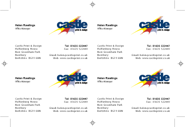
- ‘Registration’
IMPORTANT: Crop marks use a special colour called ‘registration’.
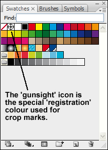
This colour is recognised by an imagesetter (the device that produces film and/or plates for the printing press) and is automatically output on all colour plates. The press operator overlays one set of registration marks over the next colour set to accurately align the plates.
It is recommended the colour ‘registration’ is not used for anything other than registration marks/crop marks etc. - Layout as above, but with bleed
Allowing for a bleed is only slightly more complicated as we need to use ‘gutters’.
I will leave the card outlines showing to explain the process easier.
We do the step-and-repeat as before but we need to allow an extra 5mm for the gutter. (see below).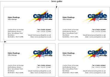
- Gutters + Crop Marks
Next: showing guttered cards with final crop marks. Again, outlines are shown for clarity.
If you want to do your own planning of cards then I would definitely recommend you check with your printer as many of them, even with non-bleed cards still require a gutter. This could be 3mm or 5mm, or none at all so it’s worth a phone call. - Still with me?
If crop marks, bleeds, gutters etc. are boring you senseless then don’t despair, just send us a card layout as below (please leave the card outline showing) and we can take care of the layout.
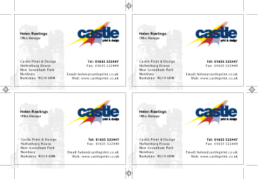
The previous examples show a 4-up card layout whereas there are many occasions where we would actually use a 4, 6, 8, 10 or even a 20 card layout, depending on the number of names, quantity of cards etc.
Tip! When ordering business cards, try and get as many names as possible in your organisation to order cards at the same time, as this will ultimately save you money.
For instance, if you order 500 cards for 1 name, we would still have to plan the cards 4-up. If however, you ordered 500 cards for 2 names, (250 each) we could still give you the 500 rate to cover both names. (Not with laminated cards although there is a reduction for grouping).
It follows that ordering 4 names (125 cards each) would still cost you the 500 rate, as we’ve managed to get all 4 names on one set up. (The biggest savings are with spot colour cards, as these are easier to produce than the laminated, thermo or die-cut varieties).
Many companies order cards for 20, 50, or even 100+ employees so grouping of names becomes even more cost effective in these situations. Laminated business cards have become very popular and, although more expensive than a ‘plain’ card, can become a viable alternative when name grouping is used.
We hope the above helps and you found our How to Design a Business Card tutorial informative.


Leave a Reply