Can I send files in Word/Publisher/Powerpoint/Paint Shop Pro etc.?
The main problems with these type of programs is that initially, they are not aimed at the print professional. As you know, they can do a superb job creating in-house stationery, presentations etc. and printing directly to desktop machines. (Publisher has improved over the years and can produce acceptable results). One of the main downsides for instance is that if you insert an image in Word this is embedded as a pixel-based image at 72dpi (presumably to keep file sizes down) and consequently would give poor results if output to a high-resolution imagesetters (2400dpi + !).
These type of programs also tend to embed images as RGB instead of the CMYK format neccessary for professional litho printing.
As with most types of problems, there are of course workarounds. If your only way of sending your artwork is by one of these programs then please try and send (separately) an original version of any graphic used in the document. The text we can cut & paste, but once the graphic is embedded then we are often stuck with a low-res image.
How do I edit a pdf?
My designer has sent a pdf however, I need to make minor edits to the text before sending it in for you to print. Can you help?
Unless you have Adobe Acrobat, (which is quite expensive if you only need to make occasional edits), then some of the other alternatives can be problematical. For instance, Adobe Illustrator will load pdf’s however, if you don’t have the same fonts on your system that were used in the pdf, then you would need to go back to the originator of the pdf, and ask them to convert all fonts to outlines. But then, if you’re doing that, the originator might as well make the edits! This may also be chargeable.
A much simpler, elegant solution is to get hold of a copy of Infix PDF Editor which, as the name implies, allows you to open and edit any pdf file (including press-ready), whether you have the font on your system or not.
It’s quick, easy, reliable and a breeze to use.
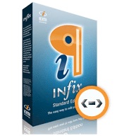

The main features:
- Works like a Word Processor
- Make seamless changes to paragraphs
- Copy and paste graphics, text and artwork between PDFs
- Spell-check in five languages
- Search & replace text in long documents
- Familiar tab, margin and indent controls
You’ve just designed my logo. Who owns the copyright?
You’ve just designed my logo. Who owns the copyright?
Once we have done any design work on your behalf that has been paid for then copyright is 100% yours. No argument.
We hear, with alarming regularity, of companies in our business that refuse to part with paid-for design unless an extra payment is received to release copyright. Personally, I think this sucks. One of our clients told us of the case where he was charged £150 for his artwork to be released and copied onto a CD!
Our simple policy is: if you have paid for artwork to be produced, then this belongs to you, and no-one else. End of story.
Quite often we need to re-design logos or create them from scratch and we are quite happy to email these to you or save to disk at no charge whatsoever, providing the account is up-to-date.
For more important information regarding copyright please see here: Copyright Information
Graphic formats – confused about jpeg’s, gif’s, tif’s, png’s, etc.?
Graphic Formats
I’ll try to keep this as concise as possible as the subject would easily fill a book!
I won’t get into the technical details of the different file formats. If you need to learn more about this aspect then a quick search in Google will yield numerous results.
Here are a couple to get started with:
http://www.dansdata.com/graphics.htm
http://www.bu.edu/webcentral/learning/fireworks1/introduction.html
Dealing with graphics depends on what you wish to use the graphic for.
For instance, if you are a web designer and your client has supplied you with a hi-res, 300dpi version of their logo, then the first thing you would do is ‘optimise‘ this graphic, which basically entails knocking down the resolution to 72dpi (the standard monitor screen resolution) and adjusting the colour amount until you have a graphic that comes in around 20 – 30k in size. This, along with any other optimised graphics on a web page, has one purpose. To make the page load as quickly as possible.
With the printing process we are looking to achieve the opposite. i.e. the higher the starting resolution, the better. As a rule of thumb, we work to 300dpi. This figure isn’t plucked out of thin air, but calculated as a percentage of line-screen used.
You are now probably thinking that you haven’t been told anything worth knowing! Let’s take a look at a few of the main formats dealt with in printing.
First of all, there are basically 2 flavours of file type.
Bitmaps and vectored images.
Bitmaps:
These are pixel-based files generated by programs such as Photoshop, Paint Shop Pro and in fact, any graphics program will output bitmap files with extensions (the 3 letters after the dot in a filename) such as:
*.jpg – *.tif – *.gif – etc.
Working with bitmaps – how many colours am I using?
How many colours to use? This is the most confusing aspect when working with bitmaps. Generally speaking, bitmap files cannot be colour-separated. (There is a way, but not used in everyday quick turnaround print jobs).
Colour-separated?
Firstly, you need to understand the difference between spot colours and process colours, see here: Spot Colour Printing. If you are only using 1 colour, or a 4 colour process (usually reserved for brochures/magazines or reproduction of colour photographs etc.) then creating a bitmap is fine, providing you have checked the resolution is ok.
If your goal is to have the job output using spot colours, 2, 3 or 4 perhaps, then creating a bitmap is not the best way forward. For this process you would ideally use a vector-based program such as Adobe Illustrator, Macromedia Freehand etc. (more info below).
If you are considering creating a bitmap to send for print then the most important thing before you start is to set the empty workspace in your preferred graphics program at 300dpi (dots-per-square-inch).
If you have already created some artwork below 300dpi please don’t try to ‘up’ the resolution to 300 as this will only interpolate the artwork (add similar coloured pixels) which will increase the output size, but won’t help the resolution. Unfortunately, you would need to start again!
Vector-based artwork
For spot colour work this is the preferred choice. File types are normally recognised by the extension .eps (not to be confused with a Photoshop .eps which is basically still a bitmap) .wmf, or .ai.
Vectored images are produced using a mathematical line description (I’m trying to keep this simple!) and as such can be enlarged to any size without distortion of the image. Also, the artwork can be edited very easily to make colour changes, line thickness changes etc. etc. An Illustrator/Freehand .eps file is easily colour-separated and has the added advantage of usually being much smaller than a bitmap of the same design.
Can you explain what you mean about spot colour and process colours?
For an in-depth explanation see here: Spot & Process Colours Explained
Will the colour(s) I see on a PDF proof print exactly as I see them onscreen?
Generally, no! Some colours are fairly representative whereas others are a long way off. The monitor you view your proof on is a device that mixes colours using red, green and blue (RGB). Without getting too technical, if your monitor has not been calibrated to display a Pantone® colour, then it’s unlikely you will see an accurate representation.
If choosing one or more specific spot colours (for branding purposes etc.) then it’s essential the colours are chosen from a printed Pantone® swatch, unless you know your screen is accurately calibrated.
An example – if you were to select Pantone® Violet in your graphics program, it’s very likely that this will show as a ‘blue’ onscreen. If you were then to look at Pantone® Violet in a Pantone® swatch you’ll see that the true colour is actually a rich purple. It follows that if you’d selected this colour for your design from what you see onscreen (blue), then it’s very likely that you won’t be happy with the final printed results (purple).
Legally, what do I need to put on my letterheads and other stationery?
Please visit this page for more info: Legal Stuff For Stationery
I’d like the option of spot UV on my cards, how do I supply the artwork?
We’ve produced an informative article on just that subject here – Supplying artwork for spot UV
I’ve done my own design. Can I send it to you in Microsoft Word?
Yes, but we would probably have to re-set it using our own professional layout program with the relevant crop/trim marks. Please note: if you do decide to send a Word file, you will need to save separately any graphics/logos used. Microsoft Word embeds images as low-res (72dpi) so it is important to give us the original separately. If sending any colour pics, these need to be converted from RGB to CMYK. We can do this for you at no cost.